Caste Study
The Hershey Company – Bringing a Familiar World to Life
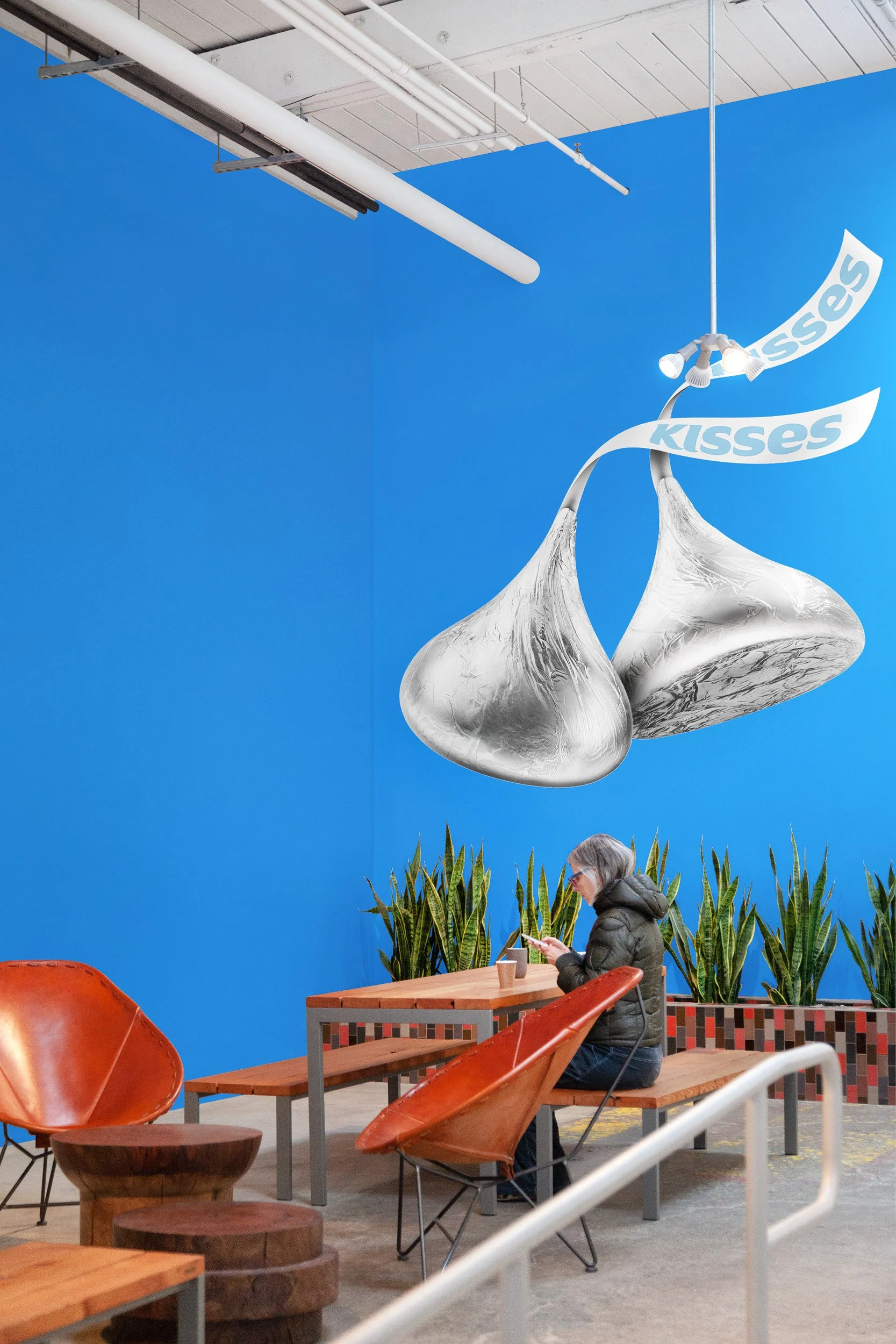
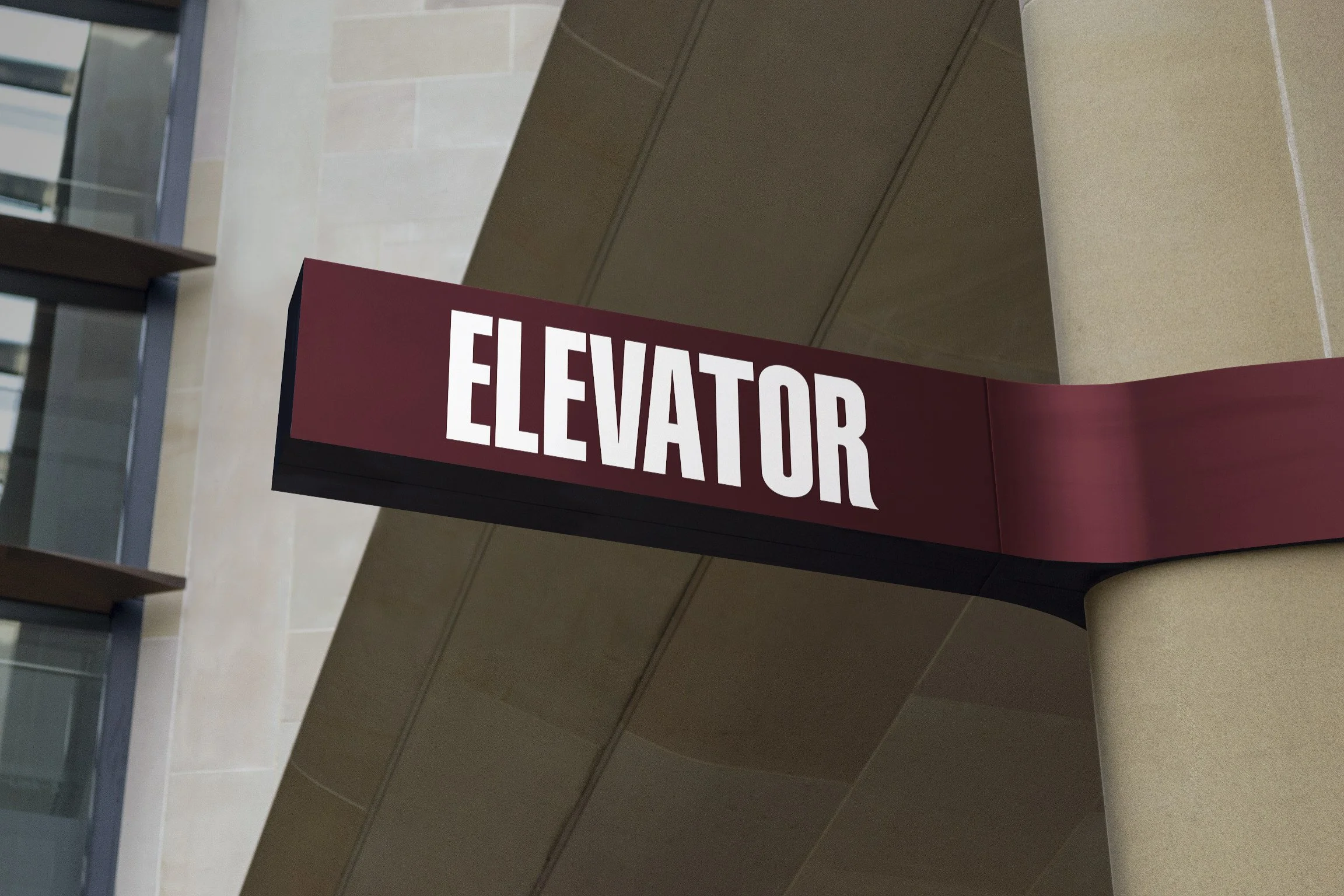
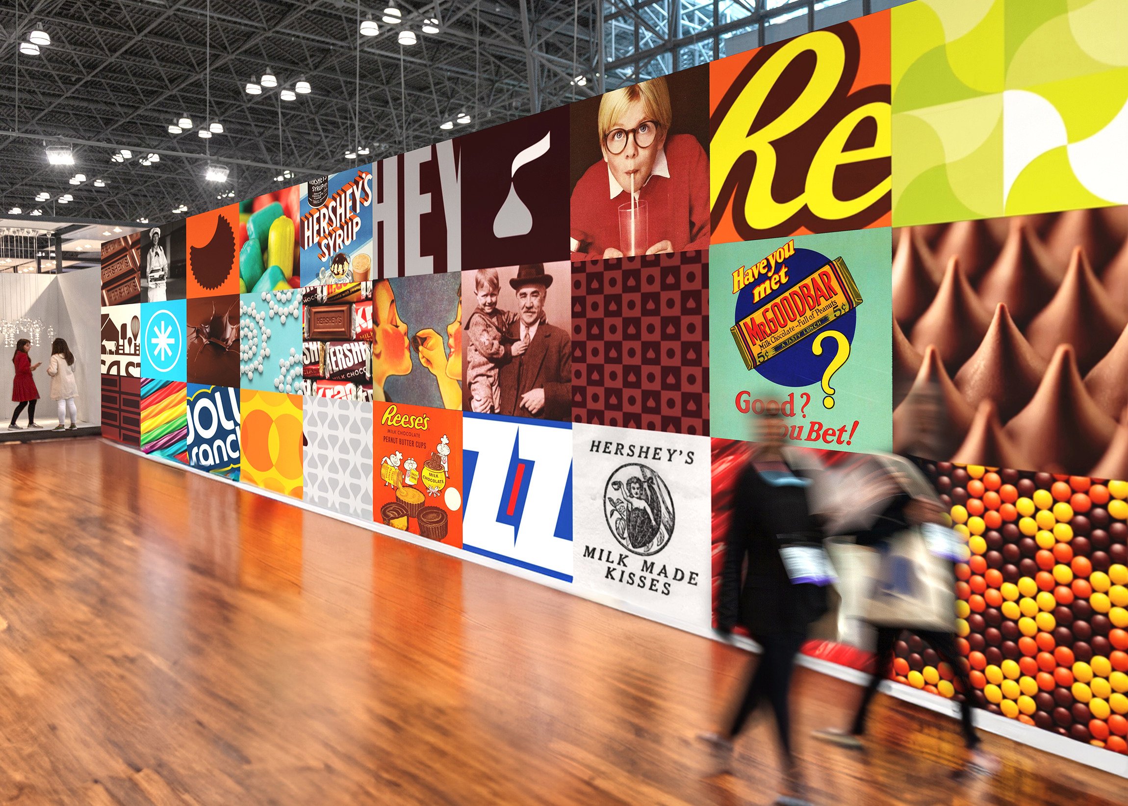
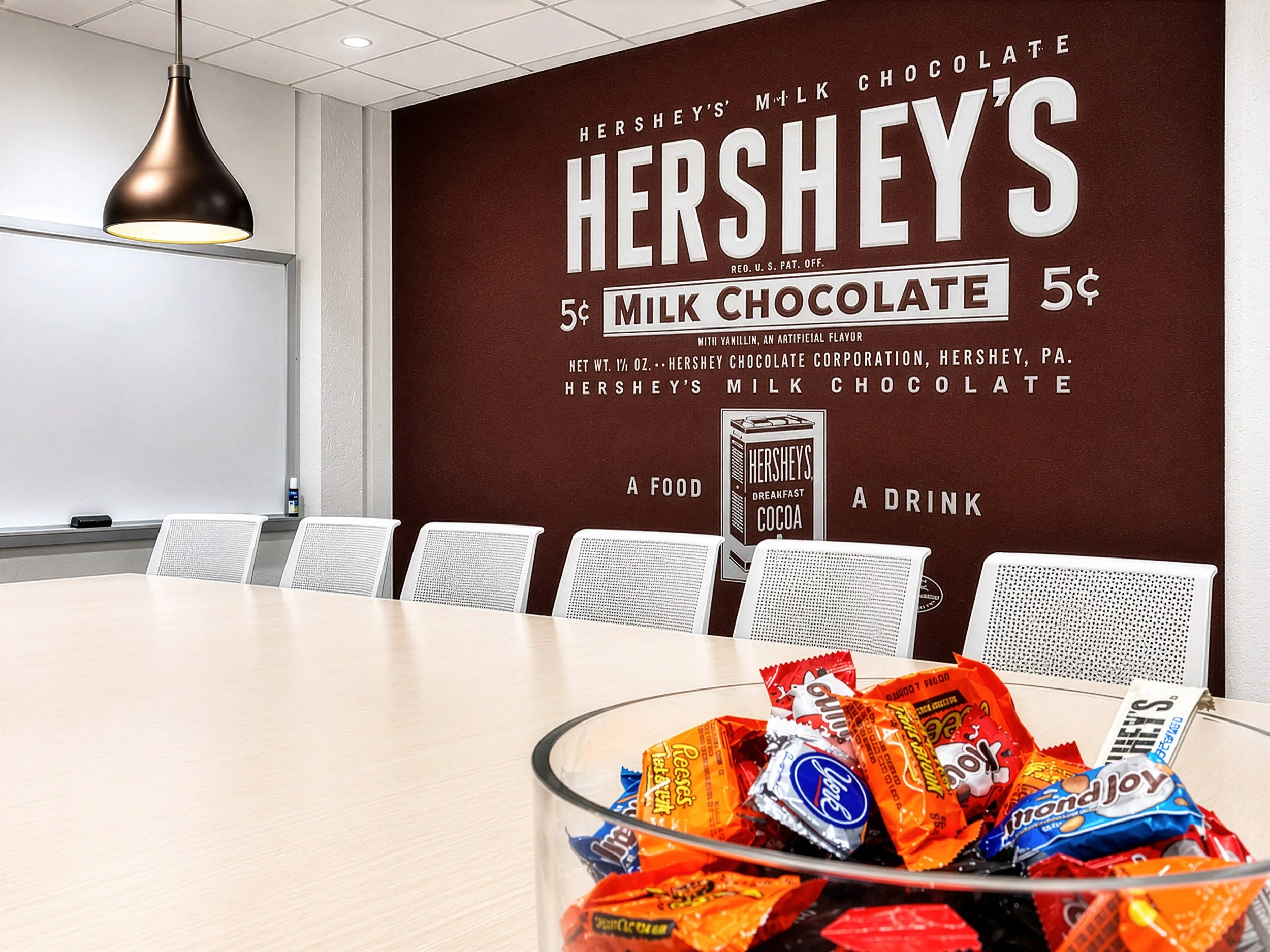
Hershey is one of those rare brands people know almost instinctively. The shape of a Kiss, the orange of Reese’s, and Munsell Maroon, the deep color of the classic Hershey bar wrapper, carry generations of memory and recognition.
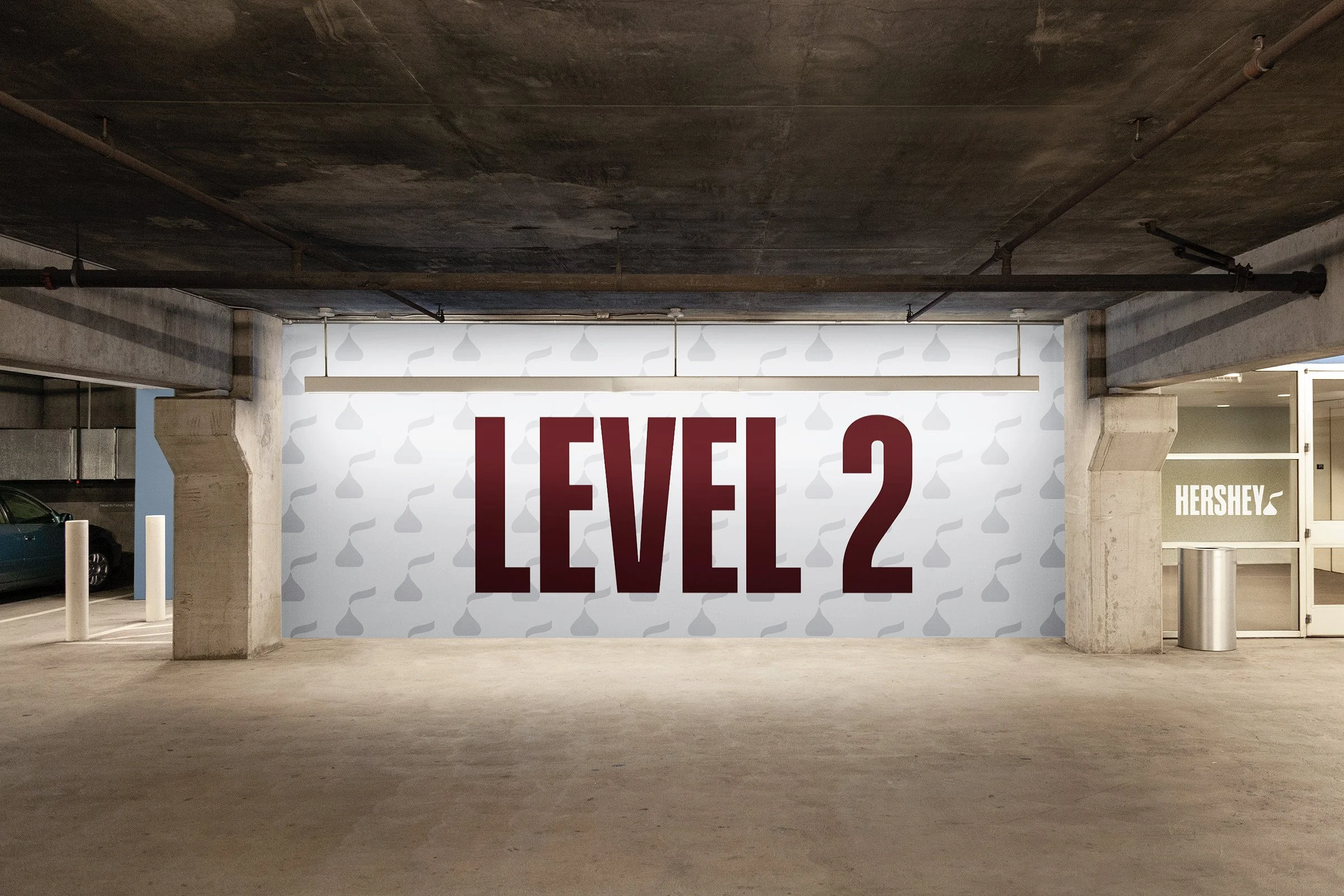
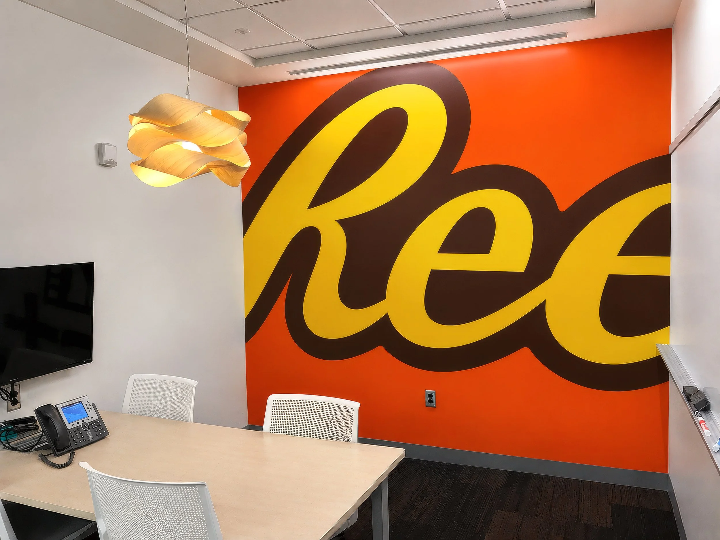
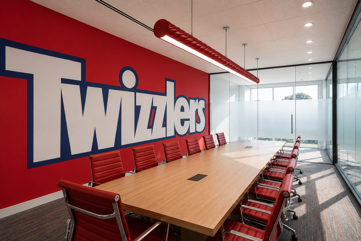
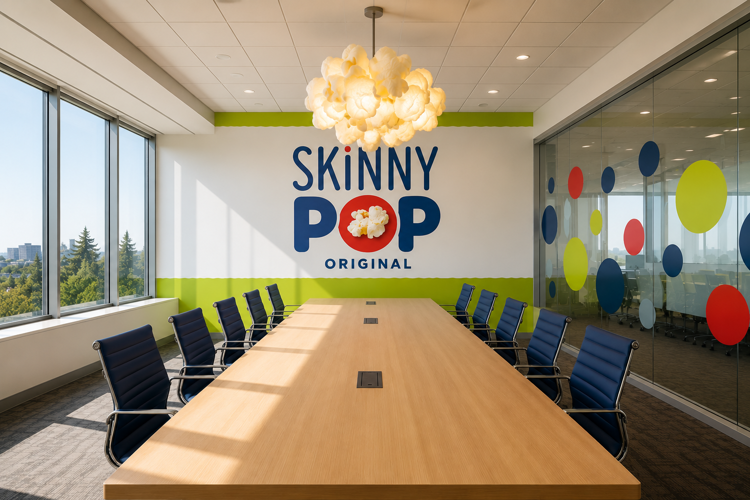
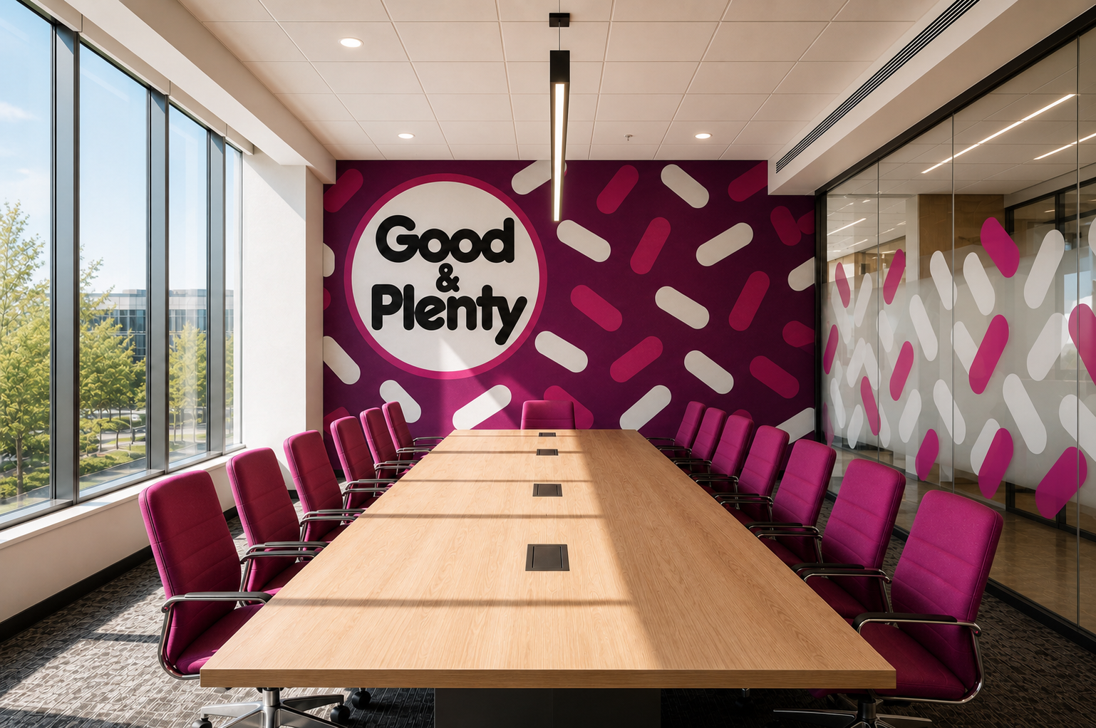
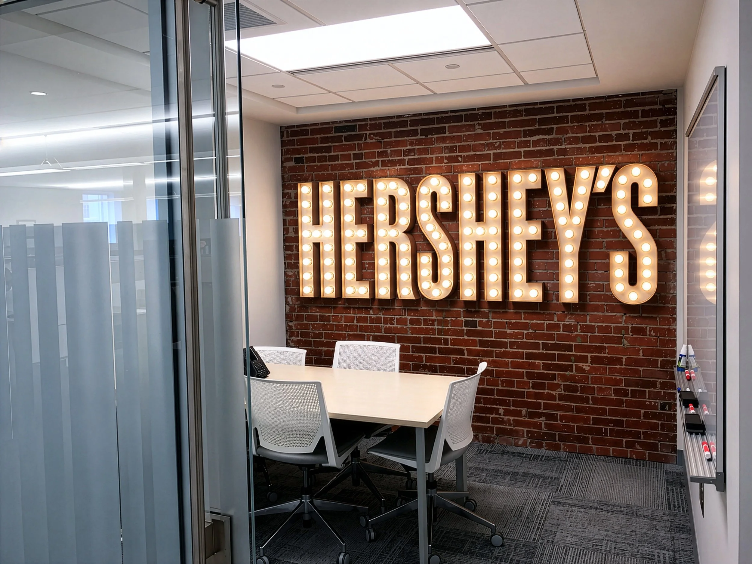
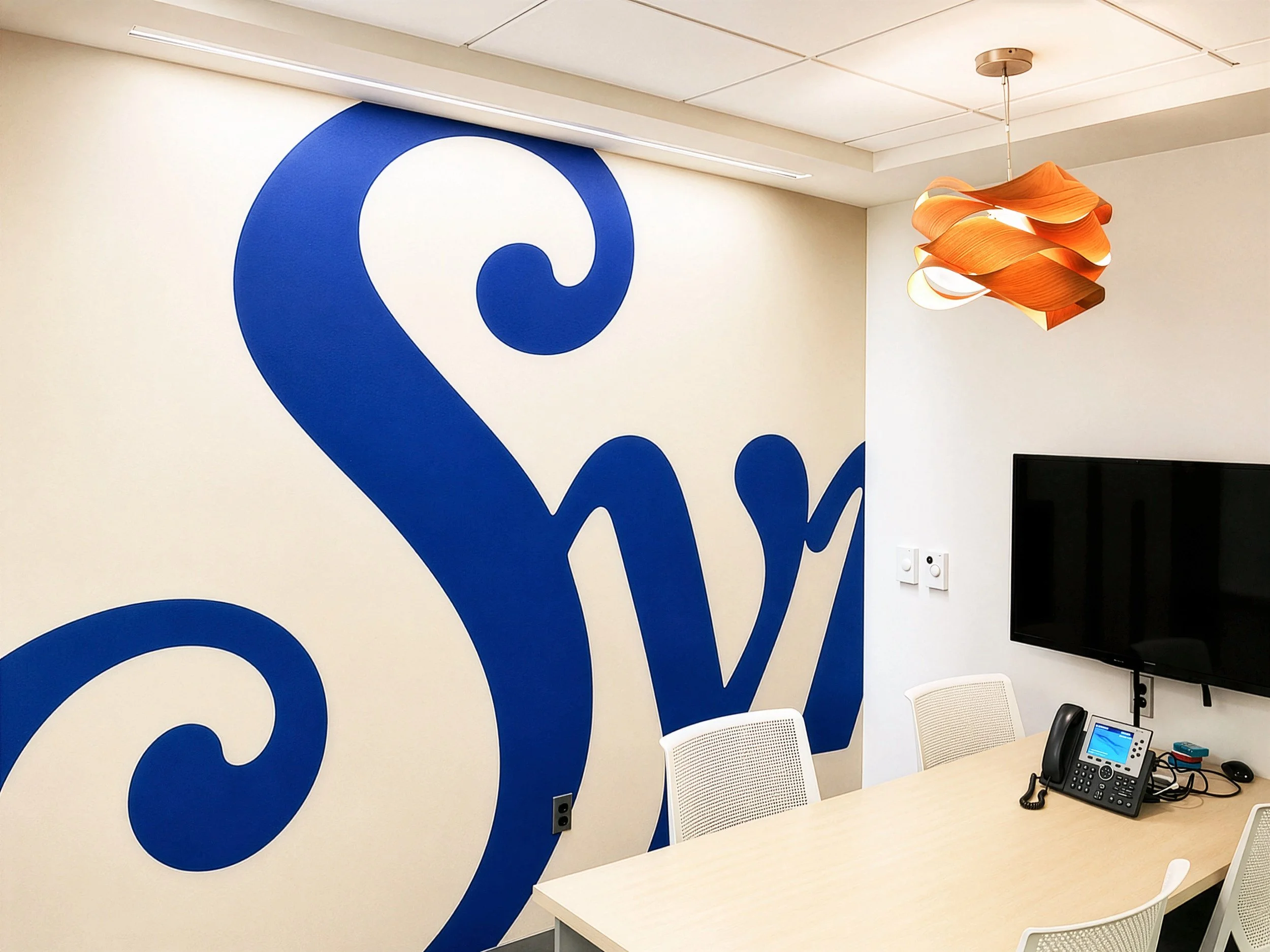
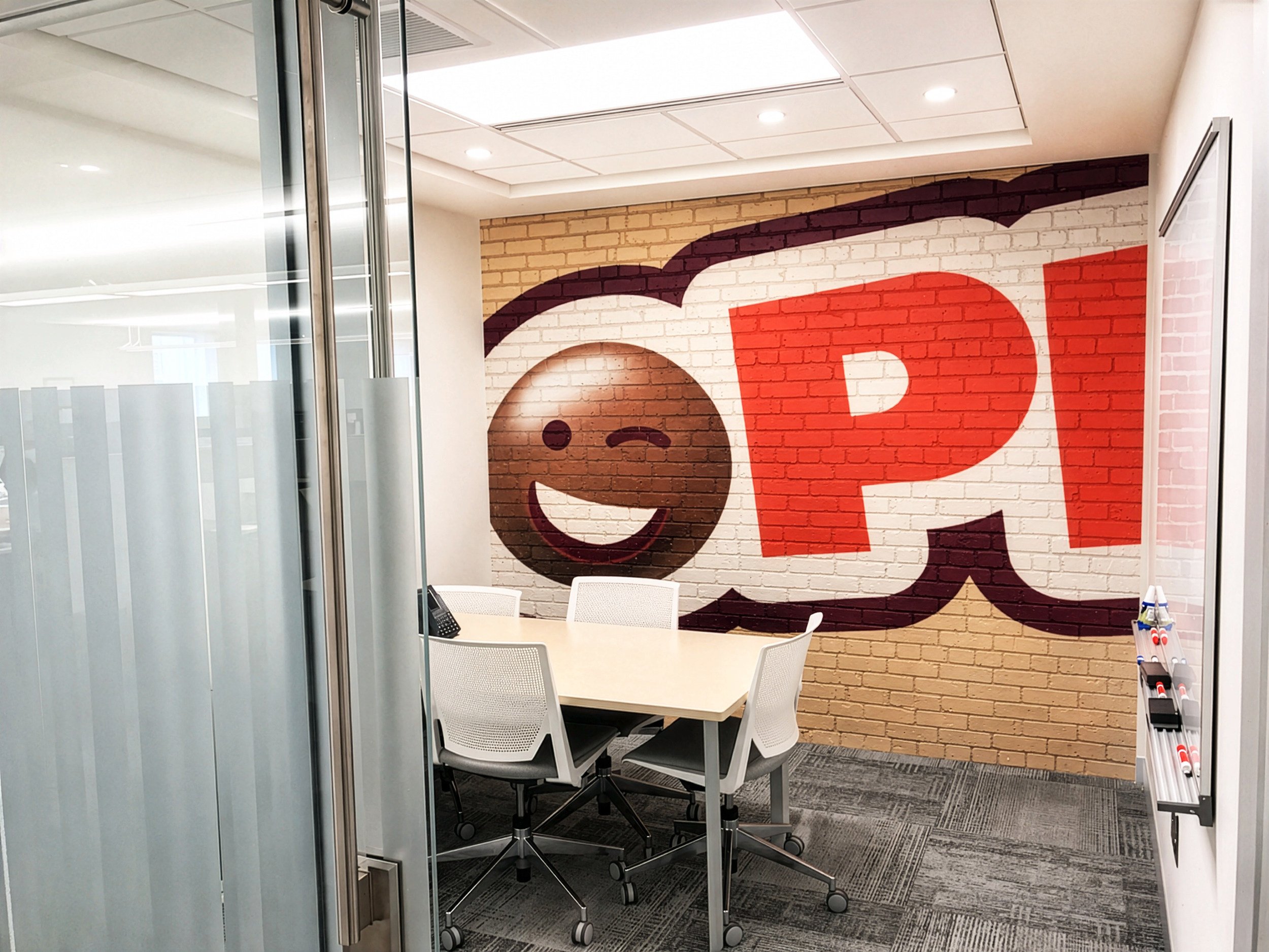
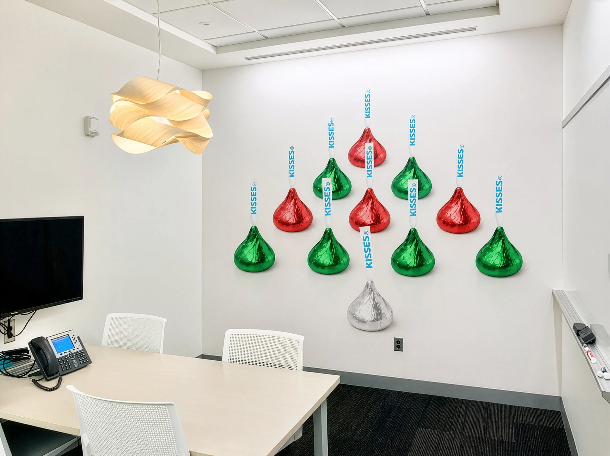
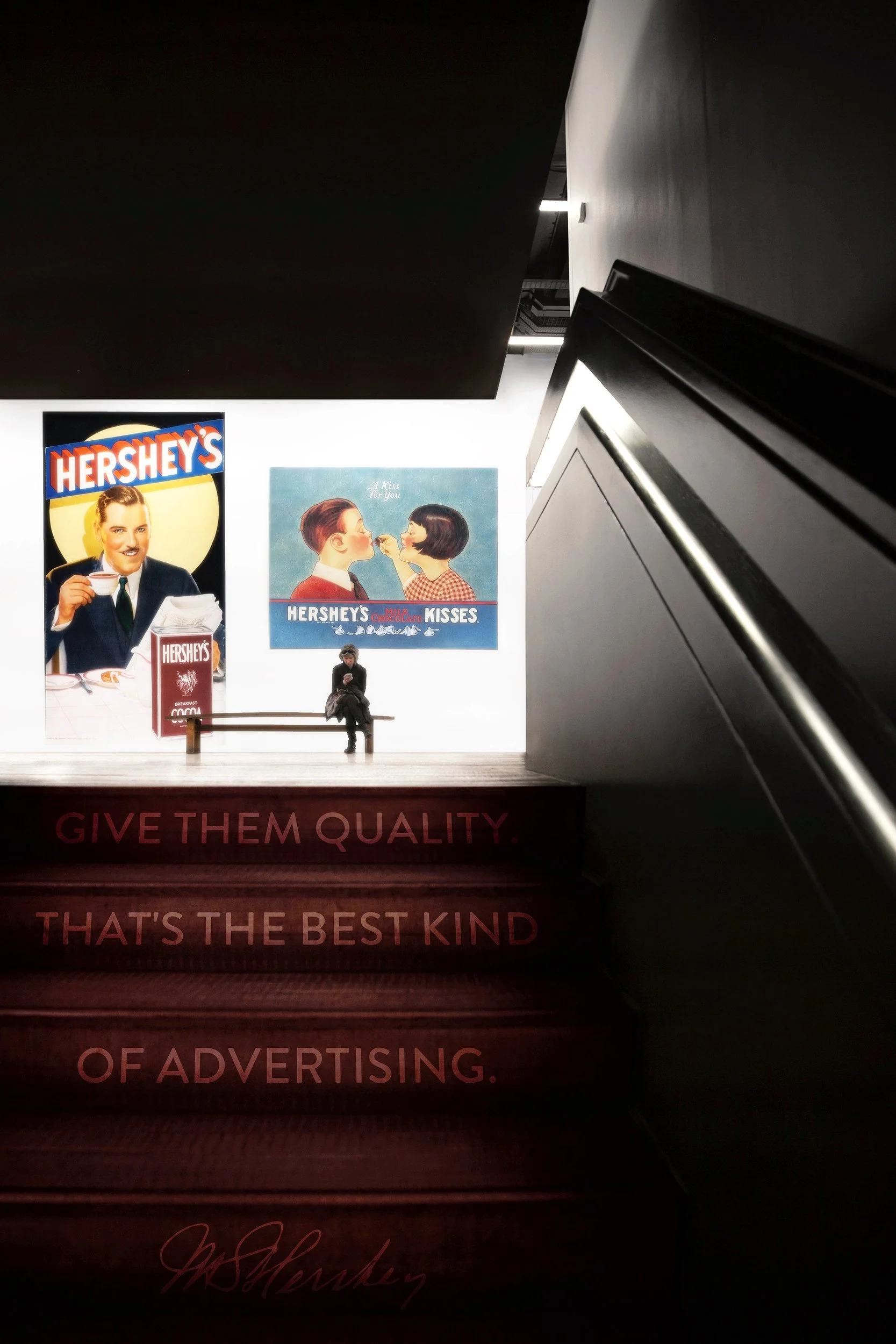
Following the company’s global identity refresh, led by Ron Burrage and Hershey Global Design, I worked with the team to explore how that familiar visual world could extend beyond packaging and into the workplace.
The responsibility was not simply to make the space feel branded. It was to work with symbols, colors, and stories that already meant something to millions of people, then translate them into an environment without losing their character.
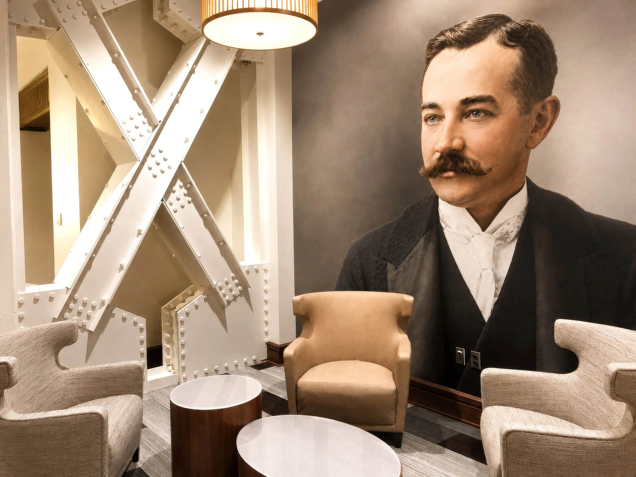
That balance was already present at Hershey’s headquarters, where original chocolate making machinery sat alongside the teams shaping the company’s evolving brands. The meeting of industrial history and contemporary design became a natural foundation for the work.
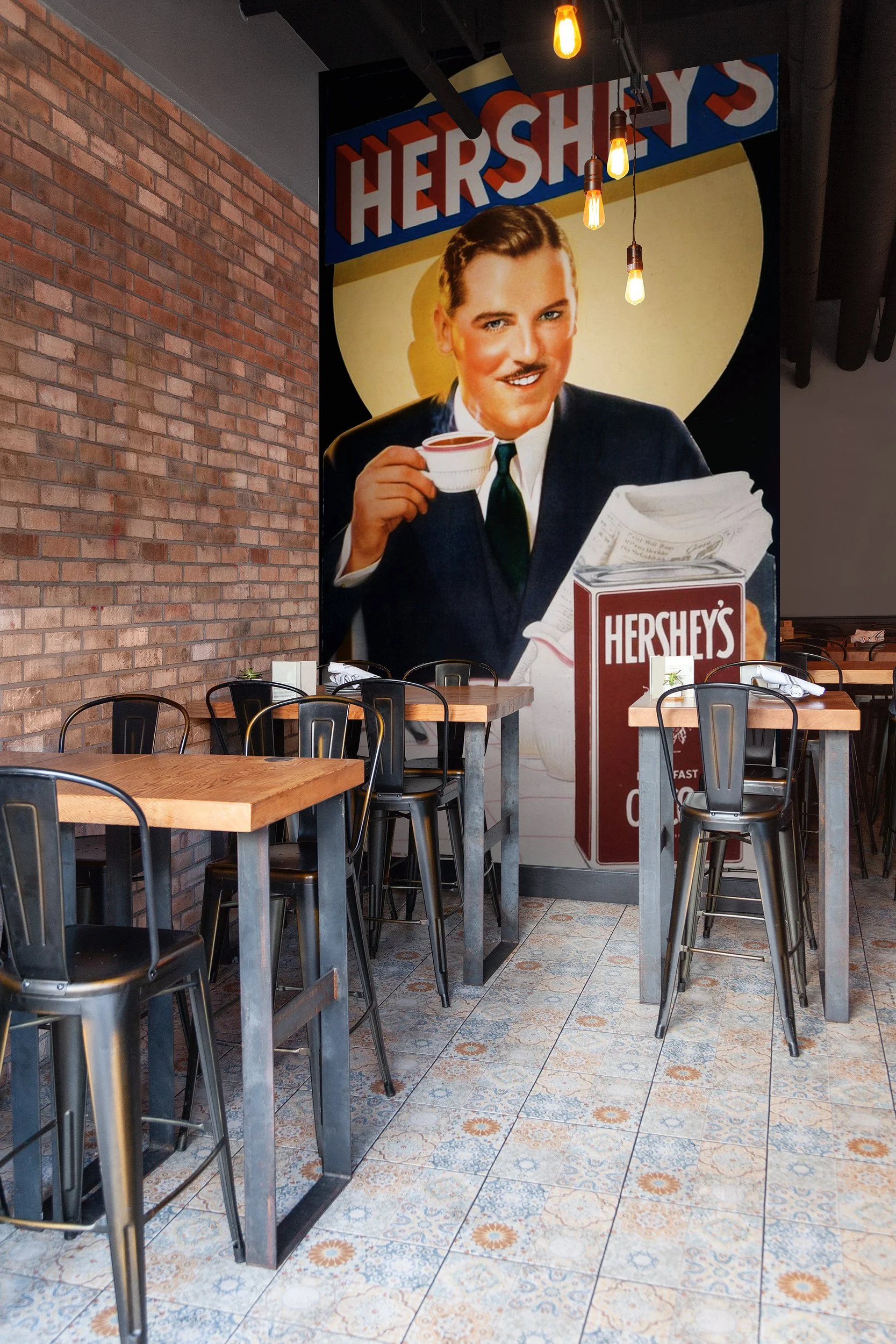
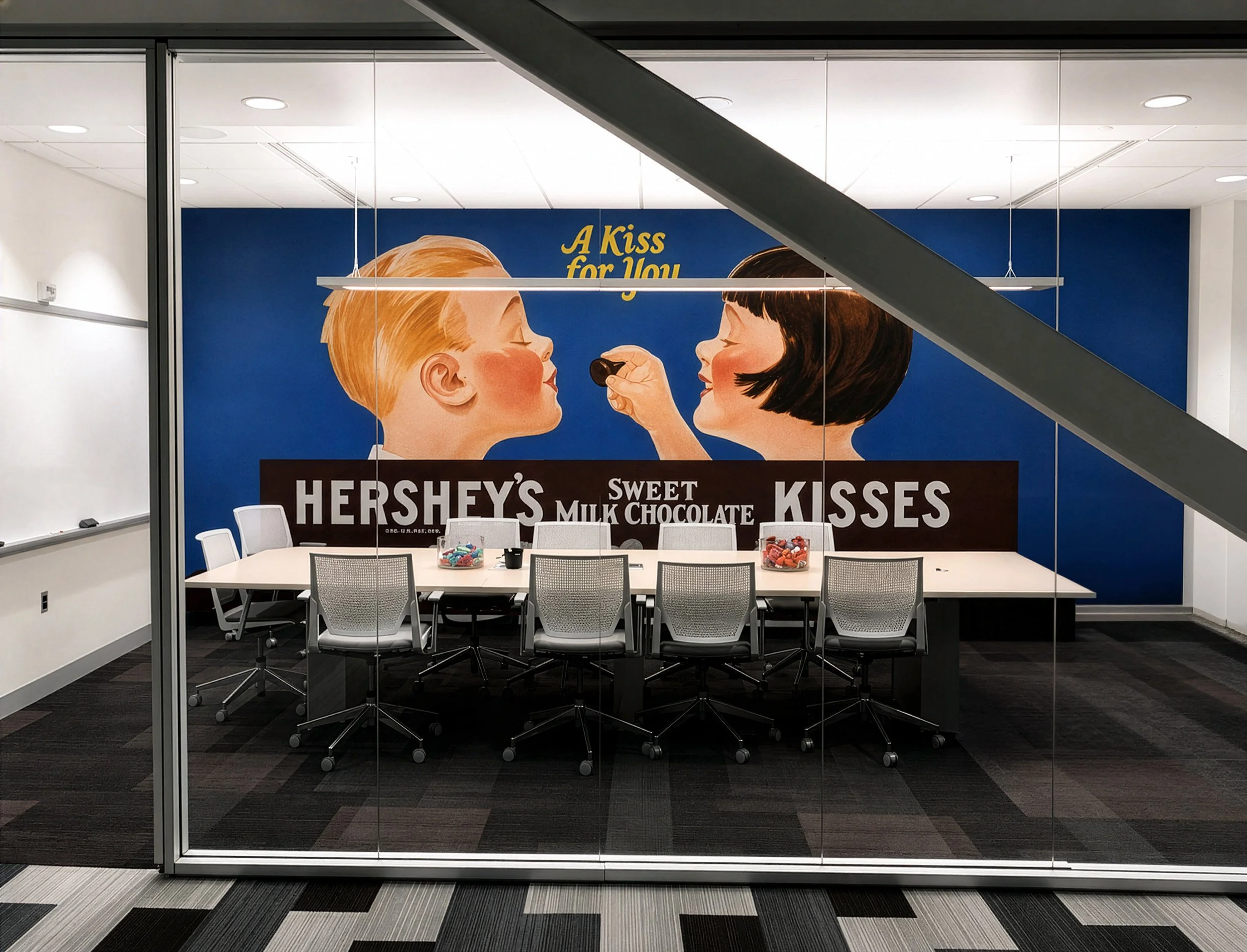
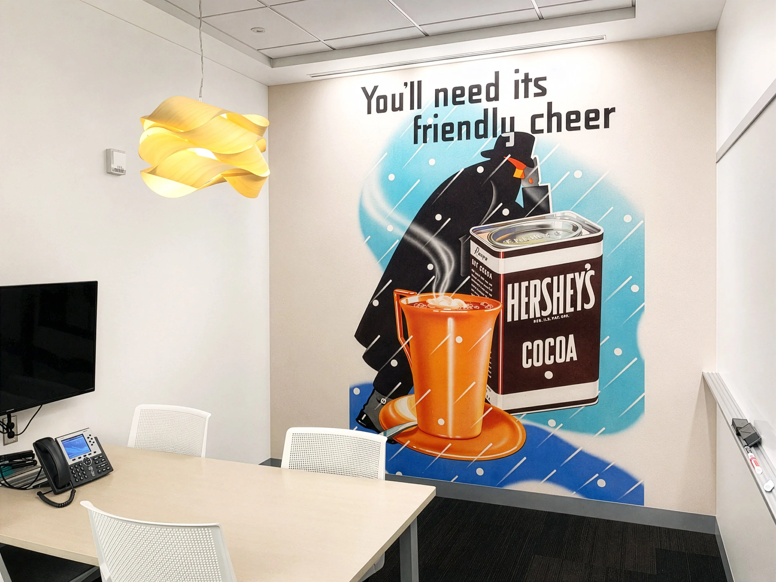
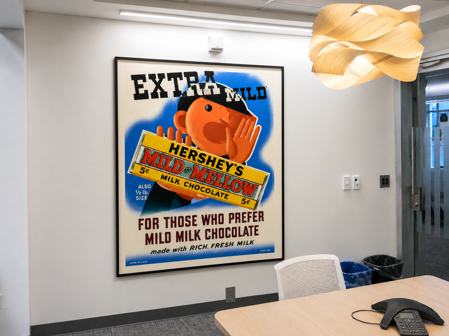
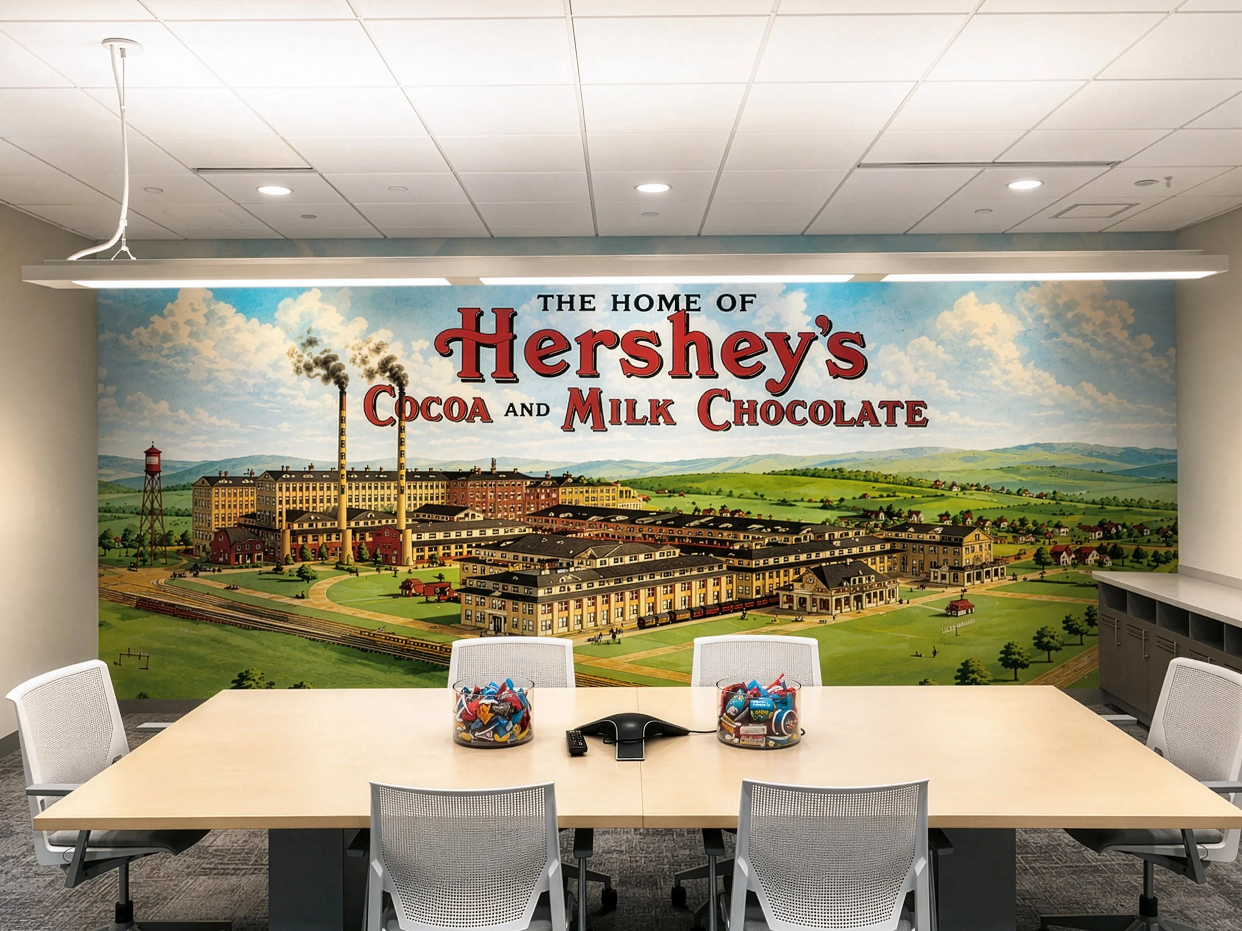
My role focused on workplace branding, environmental concepts, research, and visual storytelling. Packaging, product forms, archival photography, typography, color, and company history were reimagined through graphics, installations, and architectural moments.
The result was a workplace that honored Hershey’s history while reflecting the ambition of the company today, giving the people who work there a stronger sense of pride in what they are building next.